A compelling icon for your app can mean all the difference in standing out in the competitive app market. App icons should exemplify your brand, your app’s purpose, and the tone of your app and are all things to consider when designing your app.
At SupaPass we’ve helped countless creators build and launch their own branded apps on the Google Play Store and Apple App Store, and now we’re here to share our top tips on designing your app icon to help you create the icon that fits your project best.
Making a first impression counts, we only have 7 seconds to make a first impression, and with nearly 2 million apps on the App Store it is more important than ever to make that first impression count.
App icons can’t tell your potential users everything about your app - if they did that then they’d be impossible to read and look ridiculous. However, they can tell App Store browsers about the general idea of your app through subtle details and iconography. These subtle details of app icons can help users remember to come back to it when they see your app on their phone.
Having impactful shapes, colors, and symbols can help bring new audiences to view your app page on the stores, find your app on their home screen, and recognise it immediately when we see push notifications with your branding on them.
Knowing your market is one of the first vital steps you must take to ensure you can compete against other apps in your niche, and the best way to do this is through research.
Start by identifying your app competitors and compiling these on to a mood board to help you understand what similarities there are between the app icons.
Here are some things to consider when comparing these competitor app icons:
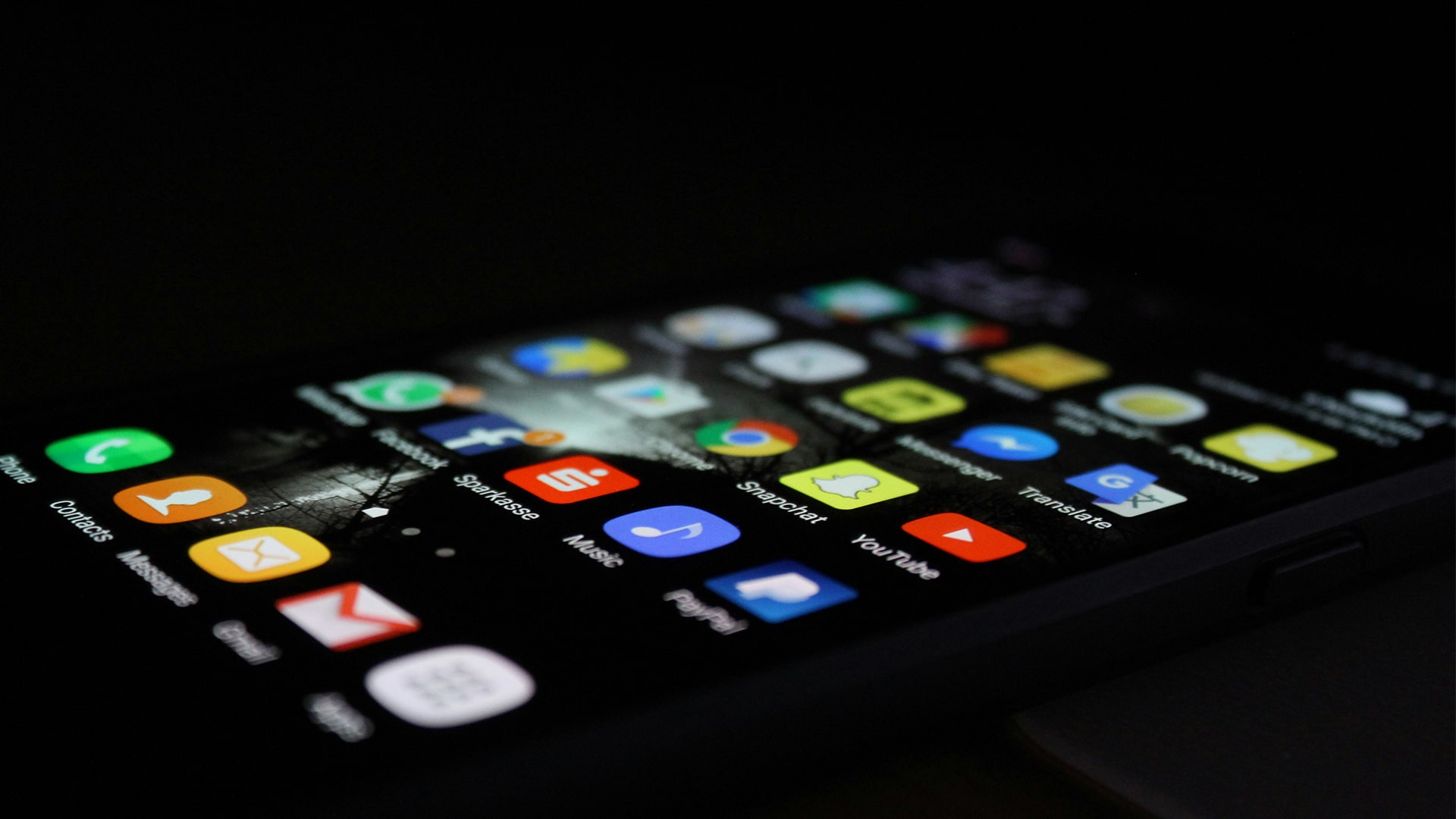
Take a look at your app home screen - what apps stand out? What do they have in common?
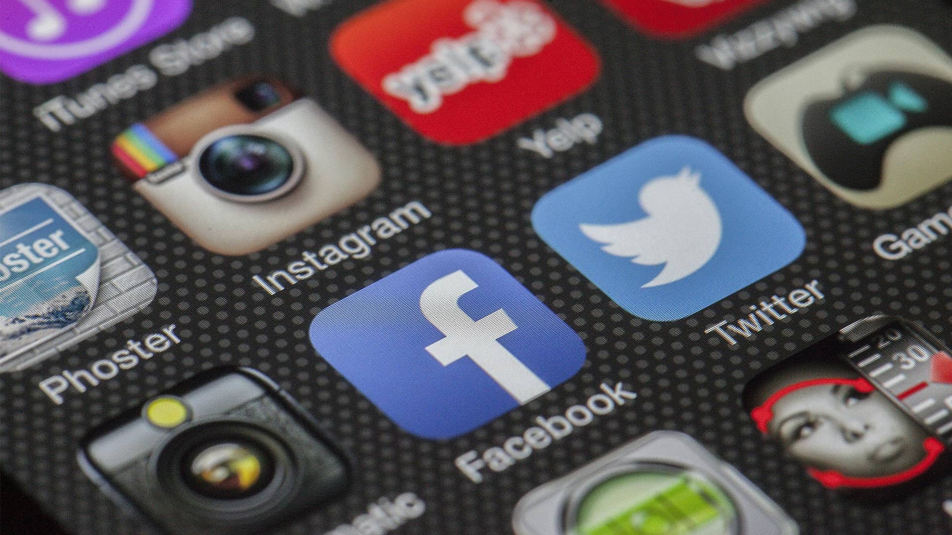
Many of these apps will use well-established iconography that businesses have built up over years, if not decades, of operating. Facebook, Instagram, TikTok, Reddit, Chrome - all of these app icons rely on simple design with easily recognisable iconography and color palettes to help their users recognise them wherever they see them, especially on your home screen.
Let’s take a look at one in particular and see how and why they use this design - Spotify.

Spotify’s logo has seen very few variations since its creation in 2006. Using three frequency waves of increasing thickness inside a green circle. This icon elicits thoughts of music, podcasting, and broadcasting immediately, so users know roughly what the app’s purpose is.
The green colour is comparatively unique in the world of app icons, helping it become more recognizable on your phone home screen.
Another reason for Spotify’s successful design is the scalability of its app icon. If you saw the Spotify icon on your phone screen, TV, or even a billboard, it would be immediately identifiable thanks to its iconic design. It is best to consider if your app could be viewed on these mediums when designing your icon - maybe one day it will be on a billboard!
All of these design choices gave Spotify one of the most recognizable app icons on the App Stores to this day.
You may have an established brand already - a website, logo, social media page, YouTube channel, etc. What colors do you currently use?
Color theory is a weighty topic, but the main aim is to use consistent colors that compliment or contrast with each other to help make any marketing assets you create be immediately attributed to your brand, regardless of the format and medium of which it is shown.
Consider what your primary color is and why you are choosing it. Color alone can be the greatest influential factor of your first impression.
Do you want to use red and go for boldness and energy? Or blue for logic and sociality? Take a step back and consider what your main themes are for your app and how you can use colors to your advantage in your icon with aligning with your overall brand.
It’s near impossible to get it right the first time. So don’t put yourself off with an unsuccessful initial design.
Creating variations of your app icon and testing these with friends, family, and colleagues to get their honest opinion can give you vital feedback on your app icon design choices and the possibilities on how to improve it.
Don’t be discouraged by a design that doesn’t meet your initial goals, instead use it as a stepping stone to get to where you want.
You may remember the logos of famous companies and brands changing over the years to reflect changes in consumer preferences, styles, and popular iconography, so you don’t need to stick to your first design!
App icons can be tricky to master, and you shouldn’t expect to get it right the first time. However, what you can do is learn about your target audience, your brand identity, and your competitors to build a strong foundation of ideas you can create iterations of to slowly perfect your logo.
The easiest way to finally have your content, audience & paywall in one place on your own website and mobile apps

Find out how SupaPass’ all-in-one app and website builder compares to Vimeo OTT - pricing, features, benefits

Building an audience connection isn't easy, but it can easily be done by using your content and user analytics to find out more about your audience

Learn how you can repurpose content so you can expand the lifespan of your hard work. Take a look at 12 creative ways to repurpose your content here.

Are you using the best email marketing tools to reach your audience and build your email database? Learn how to create a powerful email database here.

So, you’re making content. A podcast, blog, YouTube Channel, online courses, eBooks, music; but do you know how to make your content work for you?
.jpg)
“The boundless sense of the possible” - we’re on a mission to make 2021 even better for our entrepreneurs and creators, after accelerating their growth tenfold in 2020!